Vernacular Interiors From Keith's Magazine
ann wallace
Many years ago I was given copies of some treasures photos of REAL Arts and Crafts interiors. they were old negatives of pictures taken for Keth’s Magazine, found, I’m not kidding, in a barn in Minnesota where I then lived. I love these photos and have referred to them frequently over the years. You’ll see some of them scatter over the website.
Looking at old photos is a bit different. High contrast dark colors and lights pale colors - this, with less controlled lighting than we're used to, can make them difficult to read. Reds photograph as very black, blues fade, unfiltered and controlled lighting makes hot spots. Values tend to be flattened out so that some wood grains almost look like tiger strips (note floors in these pictures).
Of course, many bungalows were starter homes and this seems to show in some of the furnishings. A young couple may not have a couch yet or may be making do with a very small dining room table. There is quite a bit of wicker used indoors - this would have been considered somewhat inappropriate, but it was less expensive than wood furniture
Look for hardware, lighting fixtures, moldings, window cover and other textiles ideas in old photos.
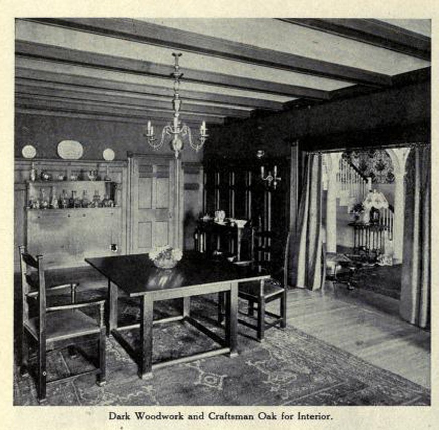
Craftsmen oak and beautiful beams, but look at the colonial revival hall seen through the archway, not to mention the out-of-place chandelier. On the other hand, I think the early American-ish chairs with their turned work, look just fine. Notice the plates displayed on the very high plate rail and the portieres in the archway. There's an entertaining sense of the owner's personality in the lavish display of decanters on the sideboard.
Here's a room with some really lovely lighting fixtures and what I suspect is a beautiful tile fireplace if only we could see it better. There is a nice pendent border at the ceiling molding - I THINK in a wallpaper although it may be a complex stencil.
I've noticed that in these old dining room pictures most the chairs are against the wall and out of the way. This would be easier on the floors and carpets which can get quite abused from the endless moving of chairs at the table. It's unusual to see French doors without curtains so I think these must open to a very private garden or patio.
Note the Queen Anne style chairs. I think the period style can work very well in a Craftsmen interior if you want to mixed it up or just have some old family furniture.
This room would look less cluttered with the contrast in the photo were not so high. Still, even with built-ins including window seats, they managed to squeeze in a nice Craftsmen settee, a Morris chair and and arm chair as well as a library tablea desk and a particularly out of place wicker chair. Note that all though the curtains are very simple, they DO have a valance on the front windows. The shadow that you see is probably from a porch roof or an awning although there very likely are shades as well.
This room is really more Art Deco then Craftsmen based on the enameled furniture and the suggestion of that classic Deco color, eau de Nile. I couldn't resist the window treatment though - a typical use of multiple sheers - 2 per window for a total of SIX - with over curtains and a hint of shade behind the sheers. Without air conditioning, all these would be called in to play to keep the room cool and also to protect the decor from sunlight.
And below, some final color!. Fabric was often printed in narrow width, directional, border fabrics specifically to be used for draperies - just finish each end and you're good to go. In the black and white photos of the times these cannot be appreciated so it's lovely to see some actual fabric from the collection of Diane Ayres.


